> For the complete documentation index, see [llms.txt](https://docs.gaiodataos.com/llms.txt). Markdown versions of documentation pages are available by appending `.md` to page URLs; this page is available as [Markdown](https://docs.gaiodataos.com/tools/tasks/analytics/forecast.md).
# Forecast
Predict sales behavior in the coming months. This is an application of **Time Series**. In essence, the technique relies on a date column and a metric, to analyze three factors:
1. **Seasonality:** peaks at certain cyclical moments (e.g. Christmas).
2. **Trend:** analyzes the speed of growth, decline or stagnation.
3. **Amplitude:** if there are rises and falls over time, it measures whether the distances between peaks and valleys have intensified or not.
Gaio can project the next **months** or **days**. Gaio uses the Facebook algorithm, Prophet, to perform calculations.
Various techniques and parameterizations are applied to the data, generating several projections and their errors are calculated. The model with the lowest error is chosen and the projections are saved in a table in Gaio.
## How to Configure the Forecast Task
***
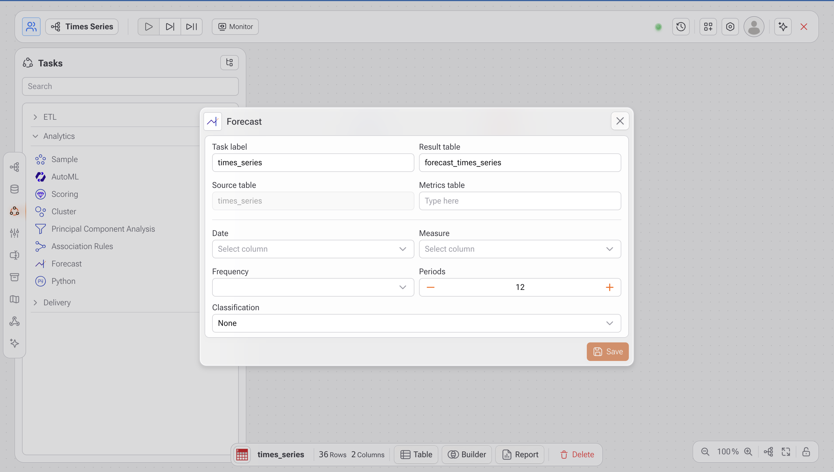
### 1. **Open the Forecast Task**
* In the **Studio**, go to the **Tasks** panel.
* Under the **Analytics** section, select on **Forecast**.
***
### 2. **Fill in the Required Fields**
* **Task label**: (optional) Name for identifying this step in your flow.
* **Result table:** Name of the output table that will store the forecast results (e.g., forecast\_times\_series).
* **Source table:** Automatically populated with the selected table (e.g., times\_series).
* **Metrics table:** auxiliary metrics reference table.
* **Date:** Column that represents the date or time.
* **Measure:** Column that contains the values to be predicted (e.g., sales, revenue).
* **Frequency:** Time frequency of the data (`day`, `month`).
* **Periods:** Number of future periods to forecast.
* **Classification (optional):** Enables separate forecasts for each group (e.g., per product, region, customer).
***
### 3. Understanding the Output Table
Once the task runs, the generated table will include the following columns:
| Column | Description |
| ---------- | ----------------------------------------------------------------------------------------------------------------------------------------------------------------------------------------------------- |
| `category` | The category for group-based forecasts. If classification is not used, this will show `nd` (not defined) |
| `dt` | Date of the record (historical or forecasted) |
| `real` | Historical value from the time series, if available |
| `type` | Value type: `real` (observed) or `forecast` (predicted) |
| `forecast` | This column has values for all lines, historical and forecast **.** This is because the model makes projections for the entire past, where it can calculate how far from reality the projections are. |
| `lower` | Lower bound of the confidence interval |
| `upper` | Upper bound of the confidence interval |
***
### 4. Visualization
It is generally desired to present the series and its projection graphically. In the [Report ](https://app.gitbook.com/o/0AwHT1YPyV5KV6qHeJNz/s/-MPpFa6rq60XeC7QMDh7/documentacao-1/studio/tarefas/delivery/relatorio)task, there is an exclusive graph for **Time Series** .
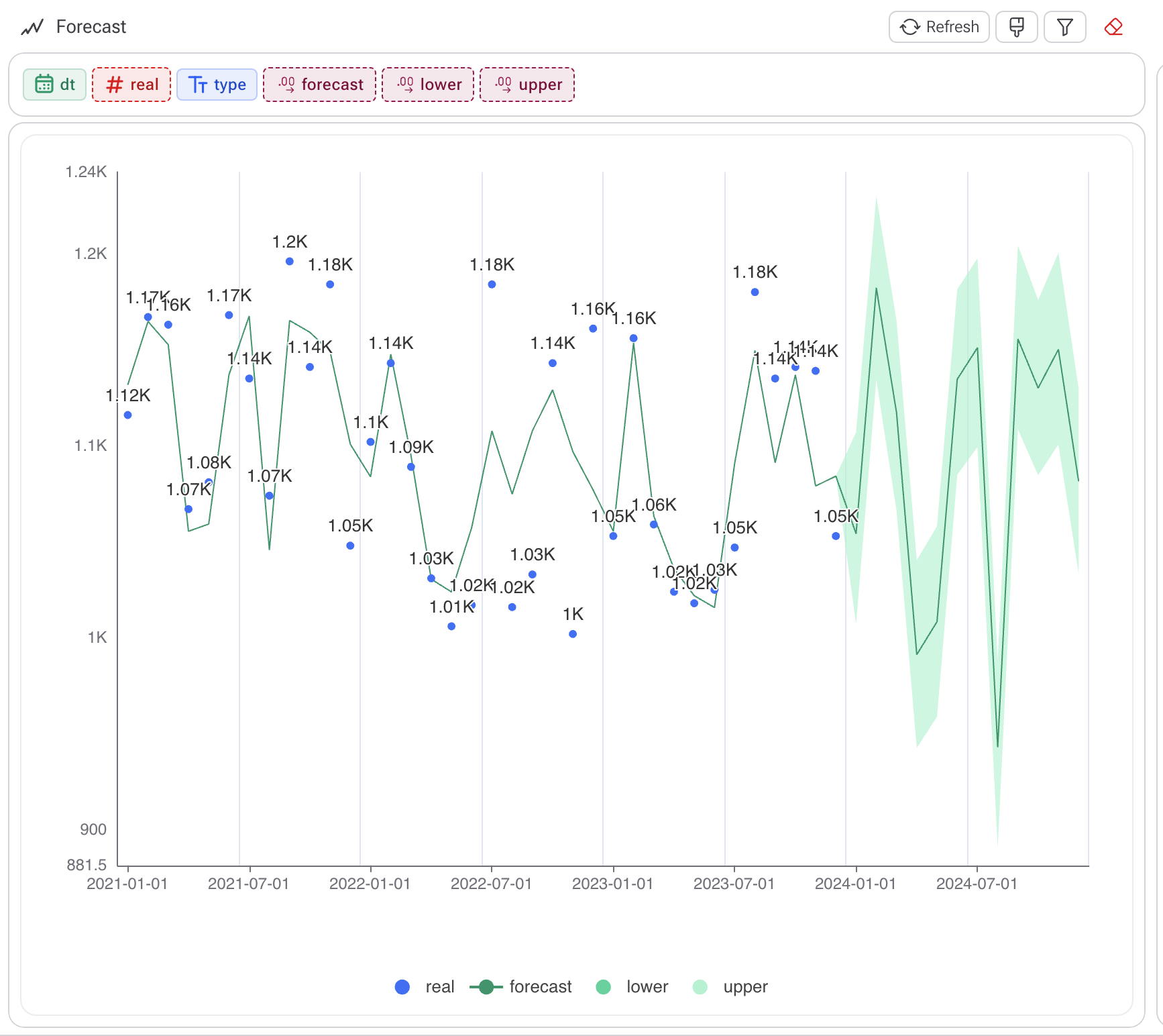
To create a chart when only one series was projected (without a column in the **Classification** ), go to Reports, drag all the fields except the **category** and sort in ascending order by the **dt column** , the date. Then choose the graphic forecast.
The result should be something similar to the graph below. The blue balls are the actual historical results. The green line is the model, which is applied to the past and future, generating projections.
***
#### Best Practices
* **Ensure clean time series**: The date column must be continuous and consistent (no missing or duplicate dates).
* **Use classifications** to forecast multiple categories independently (e.g., one model per store).
* **Visualize results** in charts (line, area) to easily compare historical data with predictions.